 Tweet
Tweet
 Share
Share
 Share
Share
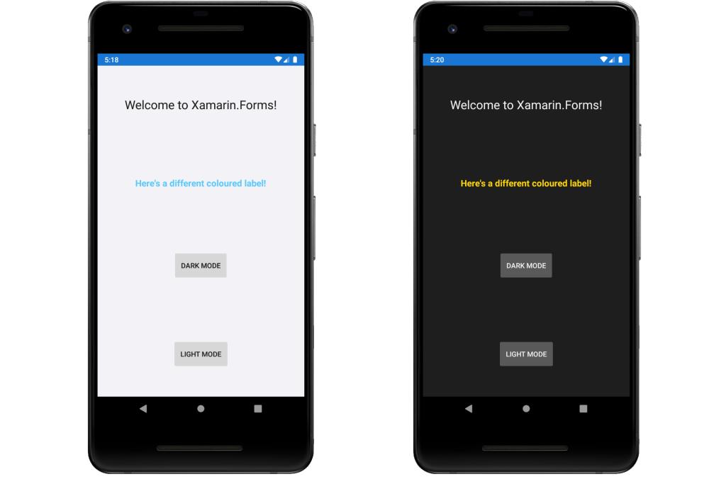
With the latest releases of iOS and Android bringing OS support for Dark and Light modes, I set out to discover how to handle this within a Xamarin.Forms app. I found some great articles by both the Xamarin team and the community, explaining how to add themes to your app and switch between them and also how to detect which theme is active in your OS. Having read these articles, there was one aspect that I hadn’t seen covered anywhere, so I thought I’d share my findings below.
A quick note: I won’t be going into depth about how to fully implement themes in your app, as this has been covered elsewhere by others. I’ve added links to the web pages that I found useful at the bottom of this article and also a link to my project on GitHub, where you can see this in action.
How do we use themes in Xamarin.Forms?
The way we use themes is by instead of hard-coding our colours and styles in the controls we use, we define them in a ResourceDictionary and reference those definitions in the controls.
For example, instead of this:
<ContentPage
    BackgroundColor="White">

    <Label
        Text="Welcome to Xamarin.Forms!"
        TextColor="Black" />
</ContentPage>
we create a light theme ResourceDictionary:
<ResourceDictionary>
    <Color x:Key="PrimaryColor">Black</Color>
    <Color x:Key="PageBackgroundColor">White</Color>
</ResourceDictionary>
and a dark theme ResourceDictionary:
<ResourceDictionary>
    <Color x:Key="PrimaryColor">White</Color>
    <Color x:Key="PageBackgroundColor">Black</Color>
</ResourceDictionary>
and then reference these colours using the DynamicResource markup extension in our ContentPage:
<ContentPage
    BackgroundColor="{DynamicResource PageBackgroundColor}">

    <Label
        Text="Welcome to Xamarin.Forms!"
        TextColor="{DynamicResource PrimaryColor}" />
</ContentPage>
This way, the ContentPage remains the same, but by changing which ResourceDictionary is in use, by setting Application.Current.Resources, we can change the colours across that page.
Styles
In Xamarin.Forms, we use styles to apply the same set of visual properties (colours, font sizes, etc.) to all instances of a particular control type. For example, we might want all of our buttons to have a grey background and white text. This reduces the amount of duplication in our code and enables us to change those properties in one place, rather than having to find and change every instance of that control.
For example, instead of this:
<Button
    Text="Button 1"
    TextColor="{DynamicResource PrimaryColor}"
    BackgroundColor="{DynamicResource ButtonColor}" />
<Button
    Text="Button 2"
    TextColor="{DynamicResource PrimaryColor}"
    BackgroundColor="{DynamicResource ButtonColor}" />
<Button
    Text="Button 3"
    TextColor="{DynamicResource PrimaryColor}"
    BackgroundColor="{DynamicResource ButtonColor}" />
we can do this:
<Style
    TargetType="Button">

    <Setter Property="TextColor" Value="{DynamicResource PrimaryColor}" />
    <Setter Property="BackgroundColor" Value="{DynamicResource ButtonColor}" />
</Style>

<Button Text="Button 1" />
<Button Text="Button 2" />
<Button Text="Button 3" />
The styles need to be part of the theme’s ResourceDictionary, as they are applied globally across the application, but this then creates duplication across the themes, meaning that if we want to change a particular style, we will need to go into each theme and change it.
How do we avoid duplicating the styles?
We can avoid this duplication by making use of Merged Resource Dictionaries. These allow you to combine one or more ResourceDictionary objects into another ResourceDictionary.
To do this, move your Styles into a separate ResourceDictionary file:
<ResourceDictionary>
    <Style
        TargetType="Button">

        <Setter Property="TextColor" Value="{DynamicResource PrimaryColor}" />
        <Setter Property="BackgroundColor" Value="{DynamicResource ButtonColor}" />
    </Style>
</ResourceDictionary>
Then reference this in both of your Themes ResourceDictionary files. In my example app, XFSharedStyles, my Styles are in a file called SharedStyles.xaml which is in the namespace XFSharedStyles.Themes.
In the ResourceDictionary for each of your Themes, you need to reference the namespace that contains your Styles and then use that to add the ResourceDictionary to the MergedDictionaries property.
<ResourceDictionary
    xmlns:themes="clr-namespace:XFSharedStyles.Themes">

    <ResourceDictionary.MergedDictionaries>
        <themes:SharedStyles />
    </ResourceDictionary.MergedDictionaries>

    <Color x:Key="PrimaryColor">White</Color>
    <Color x:Key="PageBackgroundColor">Black</Color>
</ResourceDictionary>
Now each of your Themes will also include your Styles, meaning that now you only need one set of Styles, reducing duplication and making them simpler to edit!